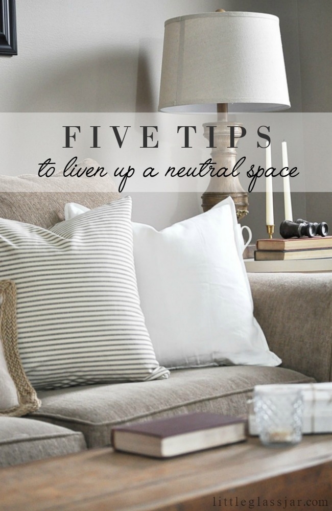
Five Tips to Liven Up a Neutral Space
When I moved out of my parents house at the ripe old age of twenty-three and into my first apartment, I was overly excited to decorate my new space. So much so that I avoided even the thought of having a roommate because I was scared our styles would clash. I wanted complete and total creative control to decorate how I wished, so living solo was the way to go. I would say over the past seven years I have learned a ton about what works for me and what doesn’t. My lessons came through many hours spent sitting and staring at a room trying to visualize its many possibilities, along with a lot of trial and error situations. I still don’t have it all figured out, and I am always learning something new about the decorating process as I go. However, one thing that has remained consistent is my love of neutrals, and my absolute fear of bright colors. And when I say fear, I mean it.
The problem with being scared of adding color into my house is plan and simply this: neutral colors can get boring. When we first moved into our current house, I was over the moon excited that our walls were taupe. Living in apartments beforehand meant my walls were always white. I could have painted them, but the thought of having to paint them back to white when my lease ended was enough for me to leave them as they were. Aside from the taupe walls, basically everything in our typical builder-grade new home was a shade of brown. I wasn’t complaining. Until months later, I got bored with it. It started to be become depressing.
A typical response to this feeling would be to add color. Yellows, blues, reds. And on a few occasions, I actually made a solid effort to throw some in. But I always hated it and would return my colorful purchases. Lesson learned: go with your gut. My gut wanted a cozy, neutral home. But not a boring one. So instead, I learned how mix and match textures, and even added in more muted tones and colors to liven up my dull color scheme. If you are like me, and have this love/hate relationship with neutrals, I have some thoughts that might help with these Five Tips to Liven Up a Neutral Space!
1 | Use white as your “pop of color”
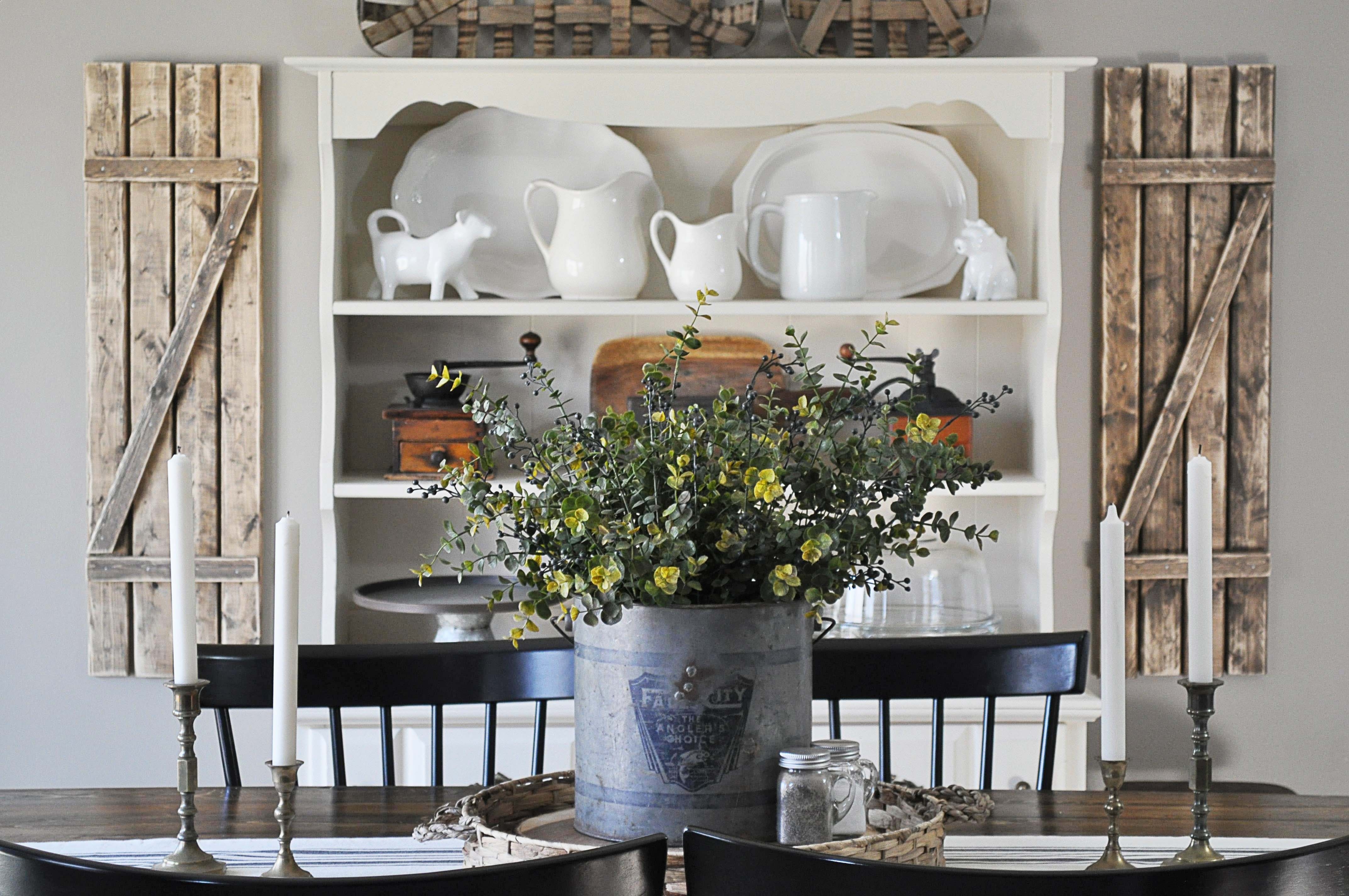
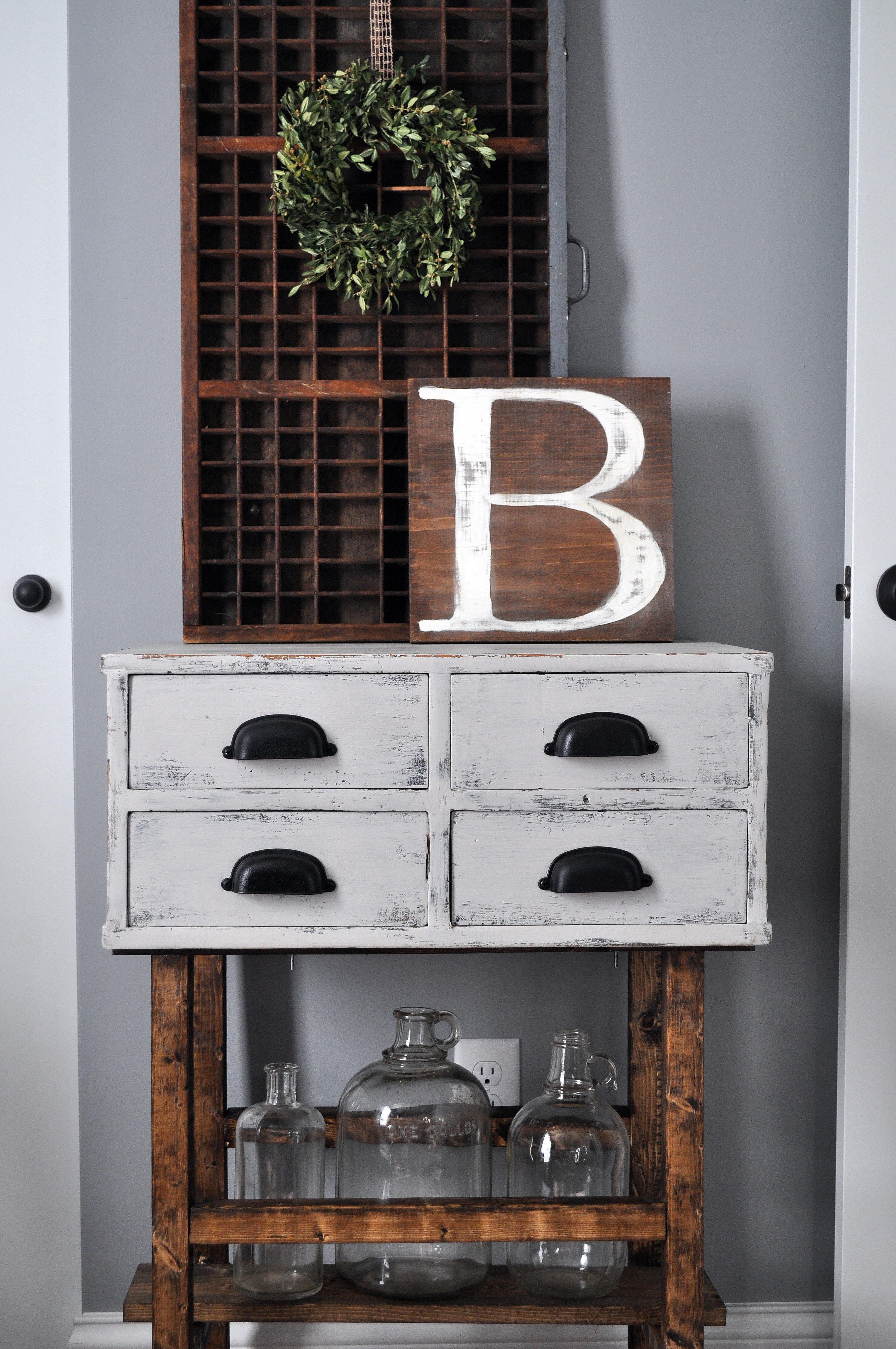
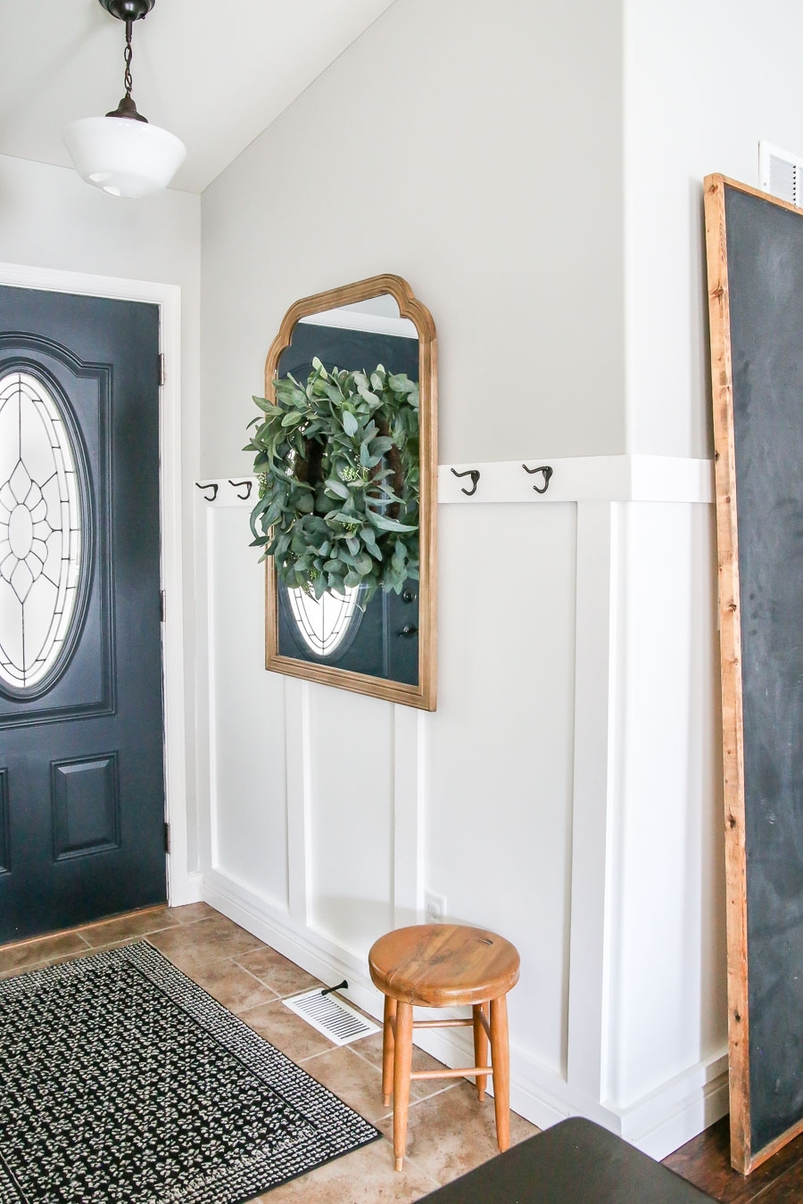
White has made a huge comeback with shiplap walls being so popular, but I like to use white as my “pop of color” sometimes. I personally have always loved a more dark natural look to my decor, with a ton of stained wood grain pieces and gray walls. When I have a space that looks too dark, or too neutral, I throw in a bright white or an ivory, like our dining room hutch and this side table. Even the smaller details such as the ironstone and the letter “B” in white break up the darkness just enough to brighten the space.
2 | Mix and Match Textures
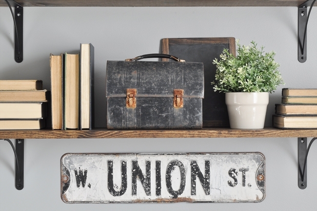
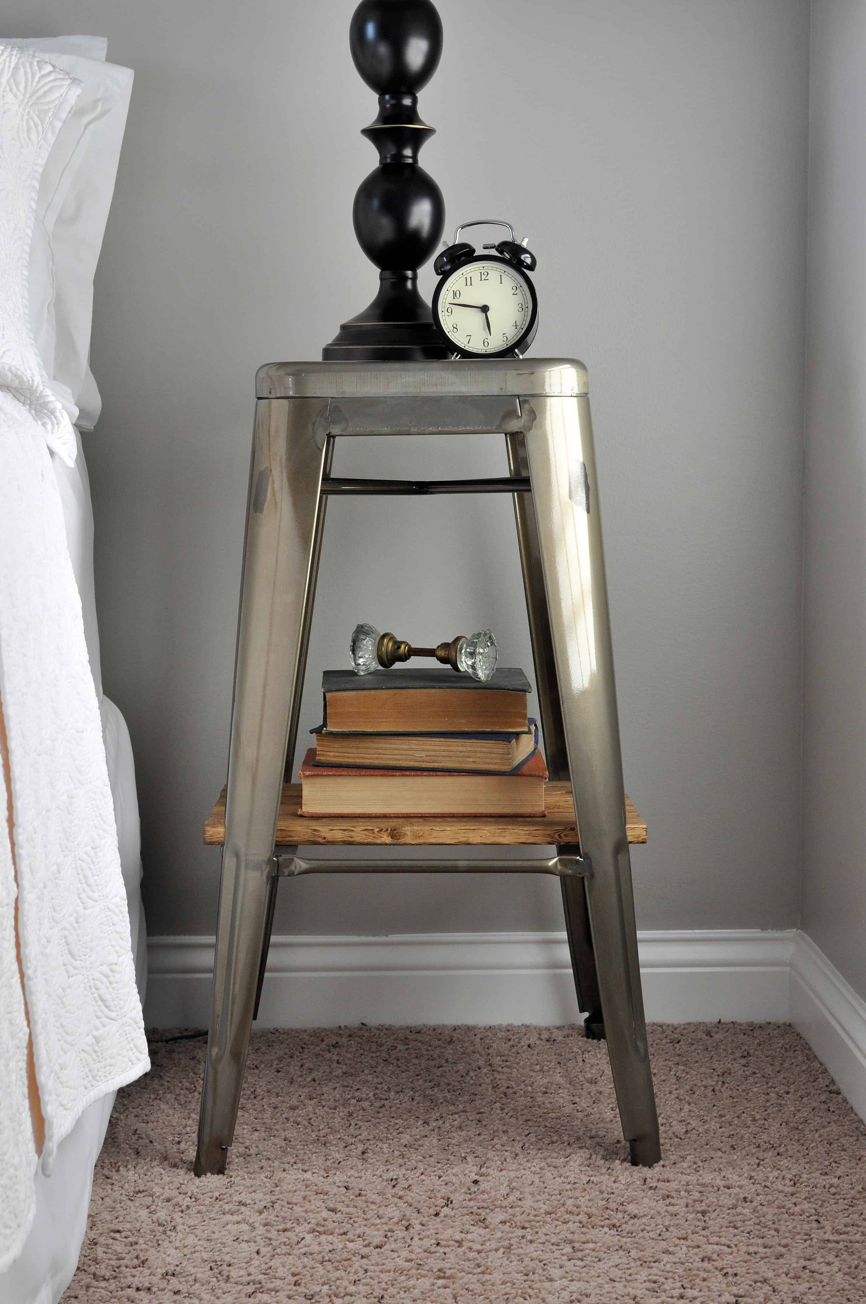
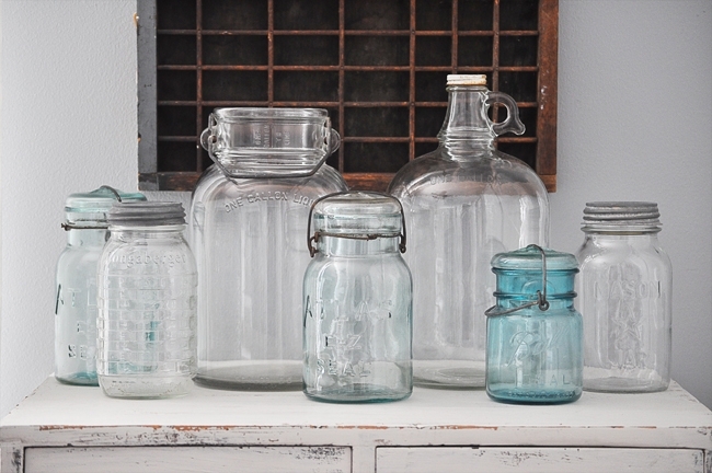
I think one of the best lessons I have learned is to mix different textures together. It will completely change the flow of your space when you do this. Old metal, mixed with stained wood, mixed with clear glass jars, mixed with some old paper books. They all just go so well together and are the absolute opposite of boring. Your eyes wonder from one texture to another instead of stare at a space that all blends together.
3 | Add Muted Colors Through Accessories
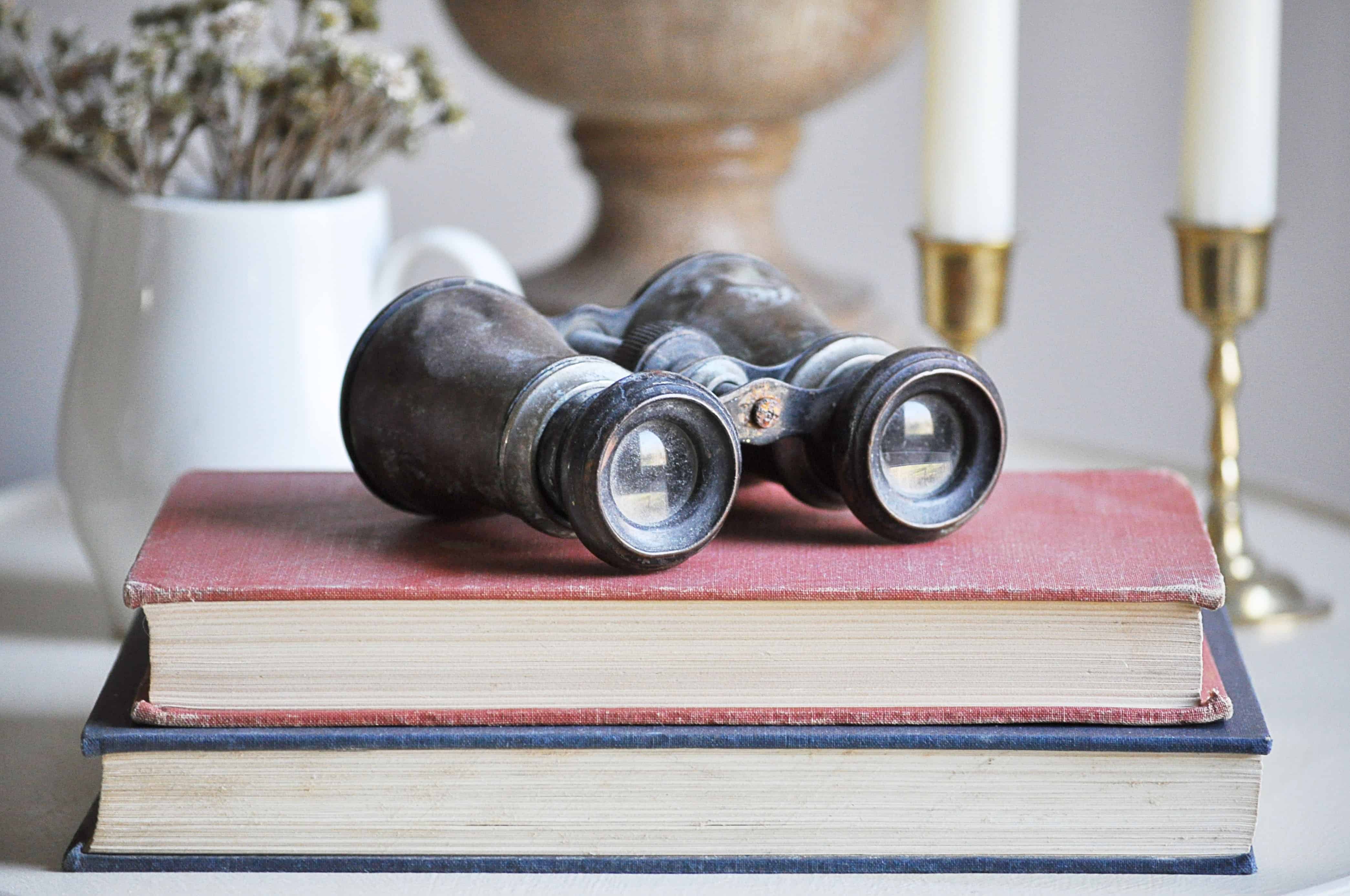
If white doesn’t work for your”pop of color,” find muted colors that you are comfortable adding into your decor. Instead of committing to painting a colorful wall or buying a color filled rug, just add in small muted tones through accessories. My favorite way of doing this is by stacking old books in different colors like dark reds, grays, greens, or even mustard yellows, or adding dull colored throw pillows here and there. Your colors don’t have to be bright in order to make a statement.
4 | Add Patterns
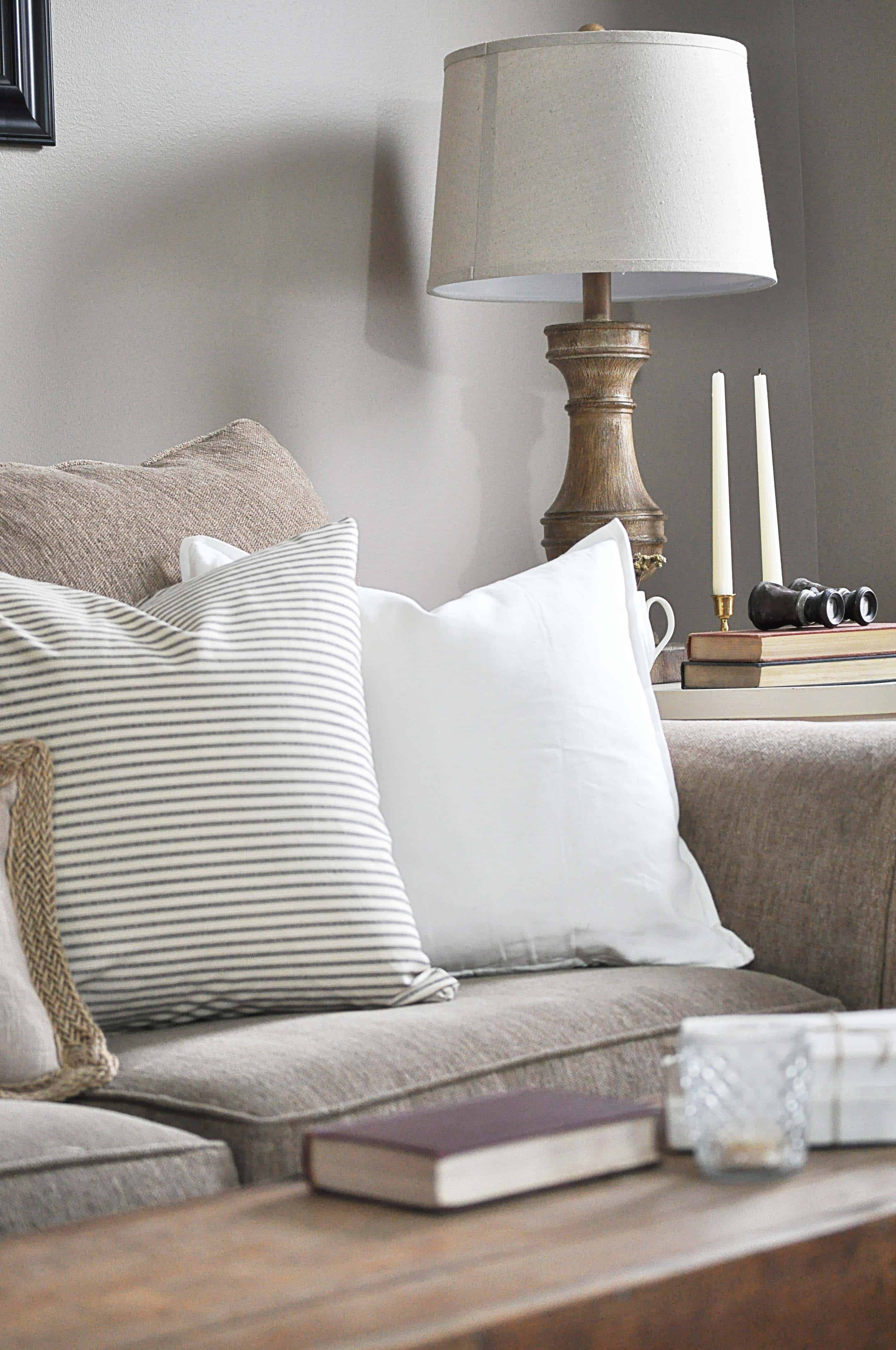
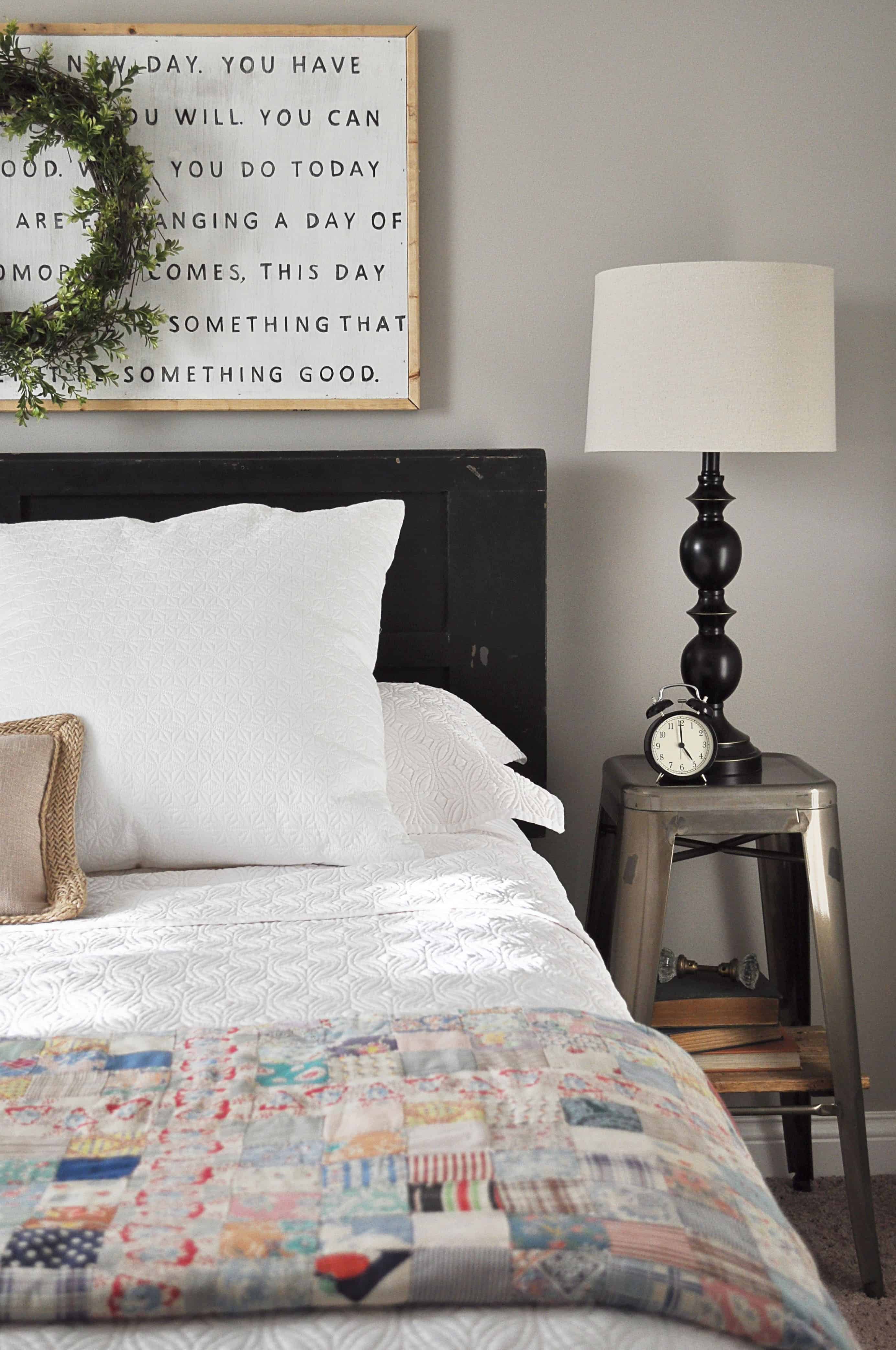
I am super picky about patterns, but when I find ones I love such as buffalo check, ticking, and plaid, it helps a boring space perk up real fast! The quilt I have in our guest bedroom is the most colorful piece of fabric I own. It isn’t overwhelming, its just right to accessorize the bed and add some happiness to the room.
5 | Add Greenery
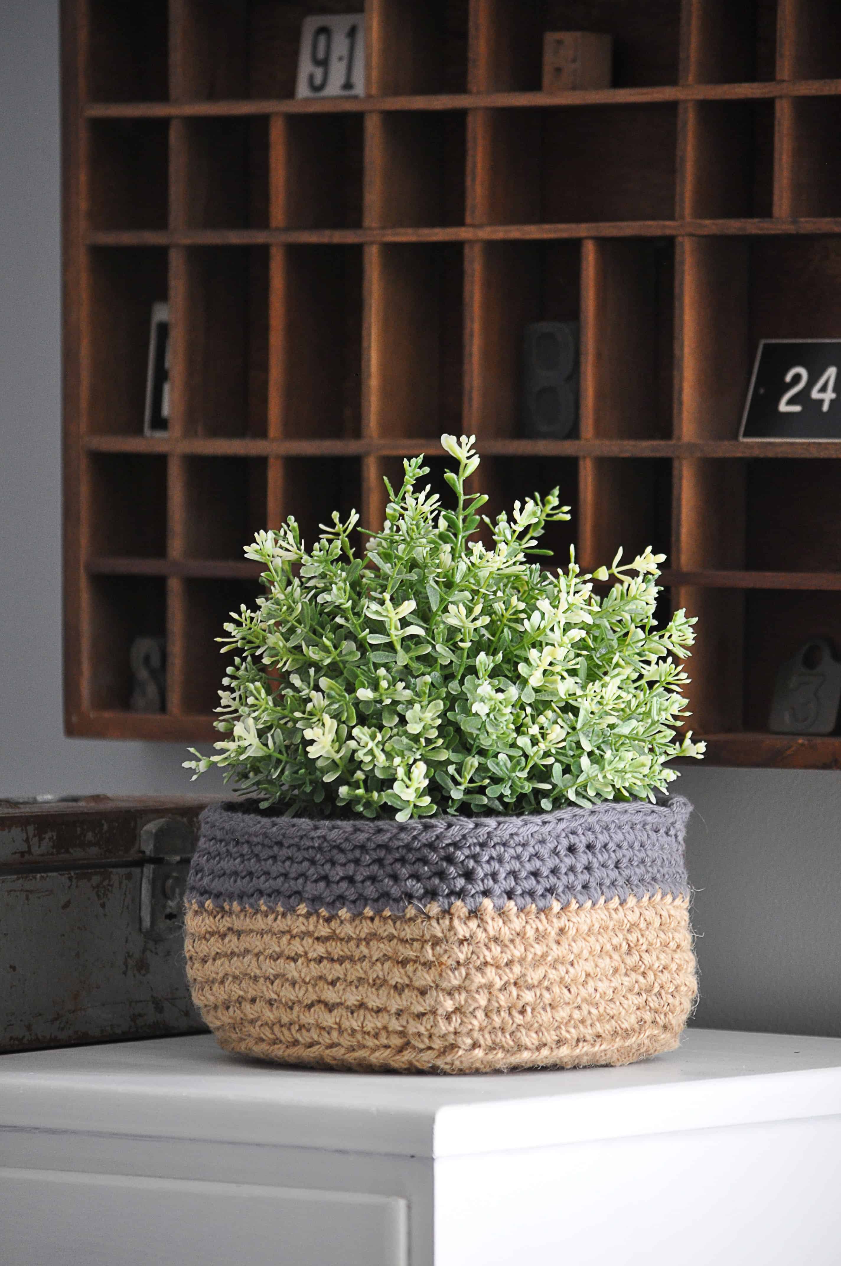
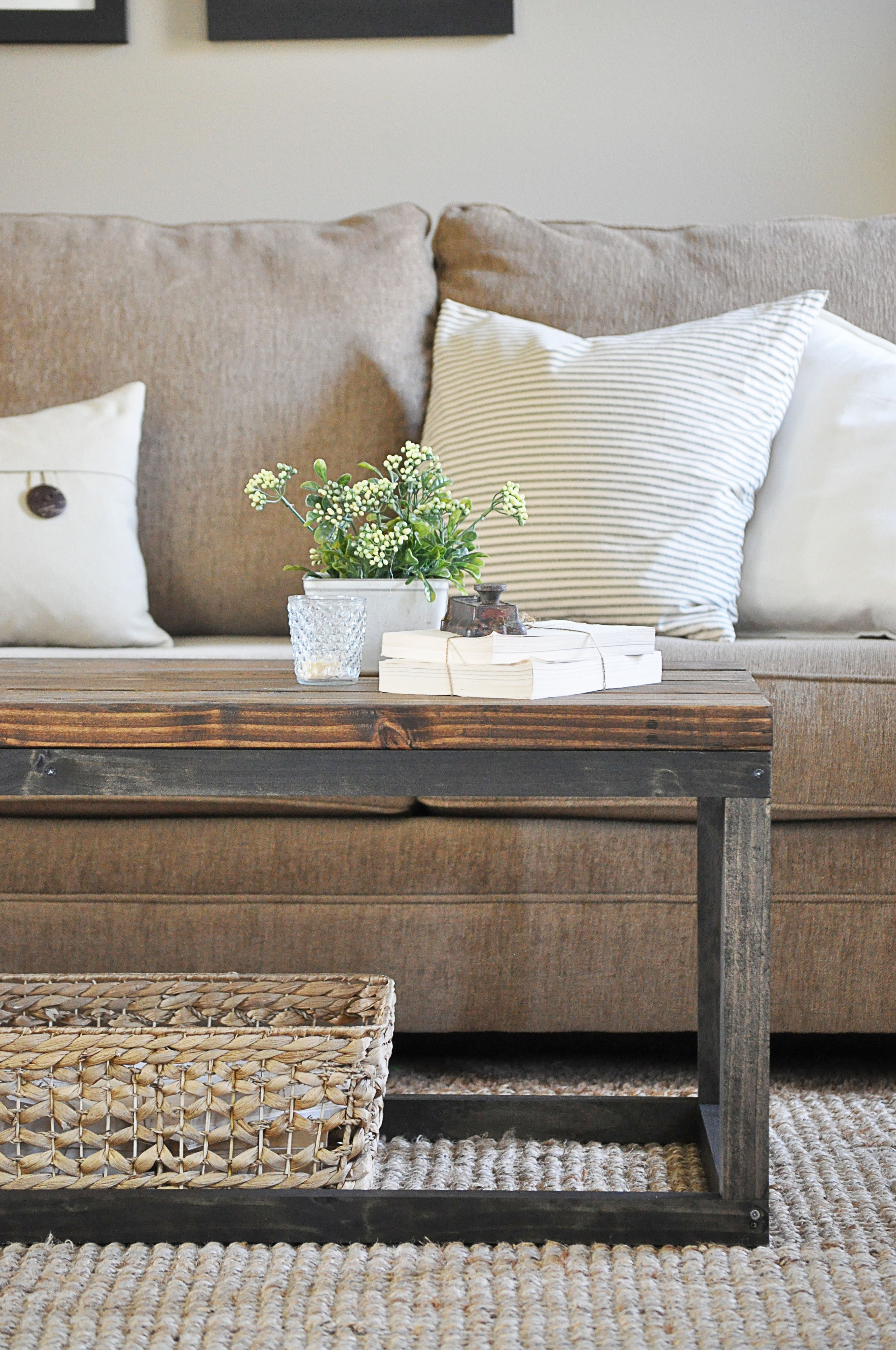
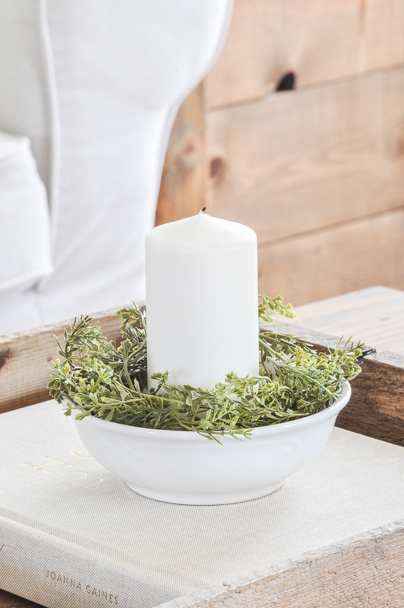
Almost all of the above pictures have one thing in common. You may notice they all have greenery of some type added to their space. Whether it be real or fake, I think greenery is key to liven up a neutral room. Yes, green can be a bright color, but for some reason it doesn’t scare me off like other ones do. It’s more natural and flows well with the earthy, neutral colors. I feel so strongly about how it impacts a space that I actually wrote an entire blog post on it that you can find [here].
I know there are some of you out there who are scared of bright colors too!
Just remember, your beloved neutrals don’t have to be boring!
Let me know if these tips work for you!


I thought previously of a neutral space as dull or like I hadn’t chosen the color scheme yet and a “just moved in and have not decorated yet” look. It does not have to be THAT way. I love it here serene and “quiet.” I have a few spots of pops of color, but not bold looking or much of it. I aim for “aged,” not the boldest look. I love the house more the way I have it now. I did not want dull looking or uninteresting or uncreative. I think I hit the right note.
Your home is so beautifully decorated! I love it!! Very motivational.